Design
A complex product deserves a website that's easy to understand, not one that's dumbed down
Most software websites fail in one of two ways. Either they publish the full module inventory, in the product team's internal vocabulary. Or they reduce everything to generic promises: "save time," "centralize everything," "powered by AI." Either way, the buyer is left to work out what the software actually does. Most don't bother.

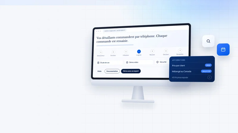
Recommendation: audit your main product page with a single question: can a qualified buyer seeing it for the first time explain, in two sentences, what the software does and who it's for?
Why software websites become vague
A product team lives with its software every day. Its module names, acronyms and architecture terms feel obvious. To a visitor, "Intelligent Control Hub" means nothing until it's tied to a task they recognize.
Usability researchers call this information scent: visitors click when a label lets them predict what they'll find. A feature name invented by marketing gives no scent. "Reconcile payments before month-end close" does.
For each capability presented, the site should answer five questions: who uses it, what triggers it, what data it receives, what it does, and which manual task or risk it removes.
The method: situation, workflow, proof, next step
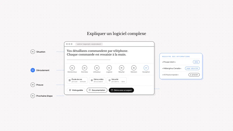
1. Start with a situation the buyer recognizes
Lines like "your teams lose hours every week" convince no one, because they could apply to any software. A specific situation does: a role, a trigger, the current process, where it slows down, and the consequence.
Take a case we know well: distributors selling to a network of dealers. Each dealer has its own prices and payment terms, and places orders by phone or email with a sales rep, who keys them in by hand before they are invoiced in the accounting software. The right reader recognizes themselves immediately. The wrong reader understands they're not the target, which is useful too.
When the software serves several audiences, build one shared main narrative, then routes by role or use case. A grid of six equally weighted cards prioritizes nothing.
2. Show a workflow, not an interface
An isolated screenshot shows that an interface exists. It doesn't show what happens. For each core use case, describe a complete workflow:
- The trigger: what starts the task.
- The input: what the software reads, and from where.
- The user's action.
- The software's action.
- The output: what has changed.
- The next decision: what the user can now do.
- The exception: what happens when something doesn't match.
Here is how we describe that workflow for Shopflow, our B2B commerce platform: the dealer logs into their portal and searches for a product by SKU. They see their own price, calculated from their customer group's rules. At checkout, they choose among the payment methods the distributor has enabled for them (card, wire transfer, cheque) or charge the order to their account under their terms, for example Net 30. The order enters the system with no re-keying, the invoice is generated in the platform and passed to the accounting software (Sage, Acomba or QuickBooks). No performance figures are needed for the buyer to grasp the value.
Every visual should illustrate a step in that workflow, with a caption explaining why the view matters.
3. Show the limits, not just the promises
Experienced buyers look for limits, because they know limits exist. A site that explains what happens when data is missing, an integration fails or human approval is required earns more trust than one where everything always works.
The website covers the limits that affect the buying decision. Documentation covers configuration detail. One caveat: don't expose sensitive operational details, such as your access structure or infrastructure, just to sound technical.
4. Tie every claim to its proof
Not all evidence proves the same thing. Before publishing a claim, check that the evidence next to it actually supports it.
| Type of evidence | What it shows | What it doesn't show |
|---|---|---|
| Customer logo | A commercial relationship | Real usage or results |
| Screenshot | That a feature exists | How the steps connect |
| Video demo | How a task unfolds | The result in your context |
| Documented case study | A result, if the starting point, period and measurement method are stated | A guaranteed result for another client |
| Security attestation | A specific control, at a given date | The security of the whole product, without scope or date |
A credible case study states the starting process, implementation scope, result definition, measurement period, data source and its limits.
To make this discipline last, keep a simple register: each claim on the site, its audience, the product behaviour behind it, the supporting evidence, its owner, its source and its review date. Any claim without evidence gets rewritten or removed.
5. Offer the right path for each visitor's readiness
Repeating "Request a demo" on every section offers no choice. Each button should match a different level of commitment.
| Path | For whom | When to use it |
|---|---|---|
| Video or interactive tour | Visitor exploring | Understand without committing |
| Documentation or technical sandbox | Technical evaluator | Check the API, architecture, integrations |
| Free trial | Self-serve user | Only if value appears without heavy setup |
| Guided demo | Buying committee | When fit depends on processes, integrations or several decision-makers |
Before clicking, the visitor should know what they'll get, what they need to prepare, what data they'll be asked for and whether a sales rep will follow up.
A guided demo shouldn't tour every menu. It should follow a workflow representative of the client and show the exception they care about. Conversely, a free trial is a poor primary path when the software only shows its value once connected to the client's systems, configured with their permissions and loaded with their data.
Structure the site in layers
No one reads a software website from top to bottom. Progressive disclosure means presenting what serves the decision first, then making specialized detail easy to find.
- Main product page: who it's for and the core workflow.
- Role or use-case pages: one audience's decision.
- Integration pages: what connects, in which direction, who owns it, and the limits.
- Security and compliance page: the evidence IT and legal teams ask for.
- Documentation: configuration, API, edge cases.
Headings should describe what the section lets you do. "Resolve discrepancies before close" is easy to spot when scanning; "Intelligent Control Centre" isn't.
The Canadian context: two languages, demanding buyers
Write for each language market
In Québec, the Charter of the French Language sets obligations for commercial websites to be available in French, and Bill 96 strengthened those obligations. Their scope depends in particular on the business's circumstances and the activities involved; have a legal professional confirm the applicable requirements. Beyond compliance, a product page translated word for word from English is instantly recognizable: borrowed terms, overlong sentences, American examples.
Each version should use its buyers' vocabulary and reflect their reality: GST, QST and HST, Canadian financial institutions, public procurement processes.
Answer enterprise buyers before they ask
Structured organizations send security questionnaires before any signature. A page that clearly states where data is hosted, how access is managed, which attestations exist (with scope and date) and how applicable privacy obligations, such as those under Québec's Law 25, are addressed can make evaluation easier and reduce some back-and-forth, without guaranteeing a shorter sales cycle. Have a legal professional validate the scope of those obligations and any compliance statements.
Write for AI answer engines
Buyers increasingly ask ChatGPT or Perplexity to compare software. These tools may cite products they can describe without ambiguity, but page clarity guarantees neither selection nor citation. A page that explains precisely who the software is for, what it does and what it integrates with may be easier to interpret than a page made of slogans. This work is part of an SEO and AI search strategy.
A ten-minute audit grid
| Question | Yes / No |
|---|---|
| Does a new visitor understand who the software is for in under ten seconds? | |
| Does the main page describe a specific situation rather than a generic promise? | |
| Is at least one complete workflow shown, from trigger to output? | |
| Are visuals captioned and tied to a step? | |
| Does the site explain at least one limit or exception? | |
| Is every numerical claim accompanied by its source and scope? | |
| Do call-to-action buttons match different levels of commitment? | |
| Does a security page answer IT teams' questions? | |
| Was each language version written for its own market? |
The grid isn't enough on its own. Then run the exercise with three or four representative buyers: ask them to explain the software, judge whether it fits, predict where a link leads, find the evidence for a claim and choose a next step. Hesitation and backtracking reveal gaps better than any report. Analytics, for their part, should prompt questions, not conclusions: frequent exits from a page can signal a satisfied buyer as easily as a lost one.
FAQ
Should a B2B SaaS website show pricing?
When pricing depends heavily on configuration, indicating the pricing structure (per user, per volume, per module) and a starting point is often enough. Giving no information at all pushes buyers to rule the software out before they ever get in touch.
How many features should the homepage show?
The right question isn't how many, but in what order. Present the core workflow that justifies the purchase, then give access to other capabilities through dedicated pages.
Does an interactive demo replace a guided demo?
No. It suits exploration. When the purchase involves several decision-makers, integrations or security requirements, a guided demo is still needed.
Do we need separate pages for each industry?
Only if the workflow, vocabulary or requirements genuinely change from one industry to another. Industry pages that only change the title dilute the site without helping the buyer.
Should a bilingual site have identical content in both languages?
The structure and commitments should be equivalent. Examples, vocabulary and sometimes the featured cases benefit from being adapted to each market.
Conclusion
An effective software website doesn't hide the product's complexity: it presents it in an order a qualified buyer can follow. A recognizable situation, a concrete workflow, acknowledged limits, evidence that genuinely supports each claim, and a path suited to each visitor's readiness. Every section should either explain a product behaviour or support a decision.
Nuevamed designs and builds websites and platforms for technology companies and software vendors, and markets its own business software. We apply to our clients the method we apply to our own products.
Facing a similar challenge in your organization?
Discuss your project